Data & Analytics
Sales Executive Dashboard
Challenge
Executives need a fast, visual read on business performance — revenue, margin, orders, and category/regional trends — without digging through raw spreadsheet rows themselves.
Solution
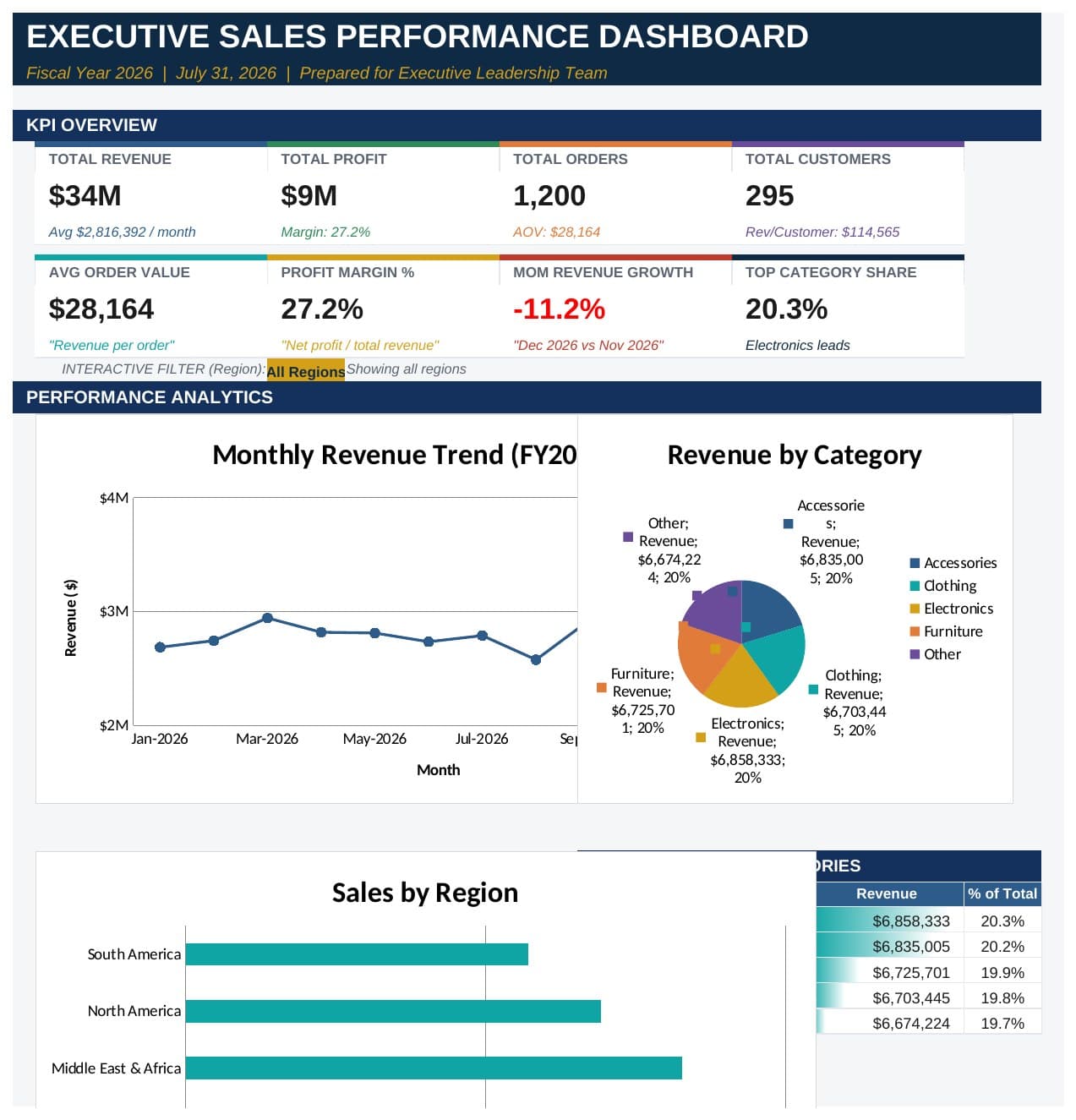
Built a single-sheet executive dashboard in Excel from a pre-aggregated sales export: KPI summary cards, monthly revenue and category/region charts, a top-categories table, and a written executive summary — plus an AI-generated insights and recommendations section interpreting what the numbers actually mean for the business.
Technologies
Features
Results
Turns a flat data export into something a busy executive can actually read in under a minute — and demonstrates comfort combining traditional Excel skill with AI-assisted interpretation of the numbers.
Lessons Learned
Reinforced that a dashboard's real job is answering 'so what?', not just displaying numbers — the executive summary and recommendations sections matter as much as the charts themselves. Also documented clearly where the source data's limits were (no order- or customer-level detail), rather than presenting figures with false precision.